Tool Bar
Midas Civil provides an Icon Menu symbolizing each function, which allows easy access to the frequently used menus.
Similar types of Icon Menus are grouped by tabs (Tabbed Toolbar). This makes the user identify the Icon Menu with ease.
In order to see the function represented by the Icon, move the mouse cursor over the corresponding Icon. Then, the tool tip description will be displayed.
The user has the freedom of customizing the toolbars to incorporate the required Icons.
The most important features of the midas Civil Toolbar are the Main Component and Sub Component Toolbars.
midas Civil Toolbar has two ranks. Individual Icon Menu is a lower rank and Tabbed Toolbar, where similar types of icons are grouped in a single tab, is a higher rank. Tabbed Toolbar of higher rank is divided into 2 groups - Main Component Toolbar and Sub Component Toolbar.
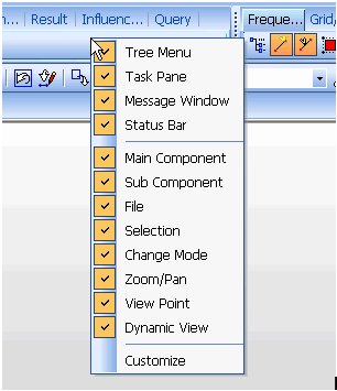
Main/Sub Component Toolbar can be shown or hidden by right-clicking on the Toolbar area and selecting it.
Invoking a Toolbar
 Main Component
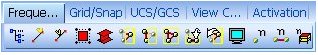
Sub Component

Main Component and Sub Component Toolbars are categorized by command groups in the Tabbed Toolbar format, which allows even a beginner to gain easy access to the Icon Menu. Main Component is composed of View and Graphic related Icons, and Sub Component is composed of the Icons used in Pre-processor and Post-processor. The Icons used in Pre-processor are Wizard, Node, Element, Property and BC/Mass for modeling, and Load for loading input. Result Icon Menu is used in the Post-processor.
Lay out frequently used commands in the "Frequently Used Toolbar" of the Main Component Toolbar, which will be quite useful. There is no limit to the number of commands that can be placed in the "Frequently Used Toolbar"
Each command can be placed, as per the preference of the user, by freely moving or copying the commands. Move a command to the desired position by dragging it from Tools > Customize > Customize. Copy the Icon Menu to the desired position by dragging it while pressing the [Ctrl] key.

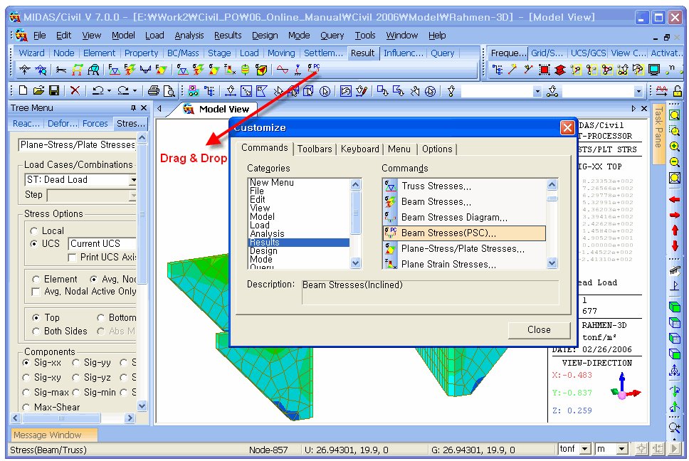
Icon Menu Customizing
Customizing the Main/Sub Component Toolbar and showing/hiding Icons can be accomplished using Tools > Customize > Customize.
Commands tab
Drag & drop a command of interest into a specific Toolbar, in order to add the command to the corresponding Toolbar. In addition, unnecessary commands can be removed from the Toolbar by dragging & dropping the command outside the Toolbar.
Categories
Select a category in which the command to be added belongs.
Commands
Select a command to be added, and drag & drop it to the desired position.
Description
Short description of the selected command.
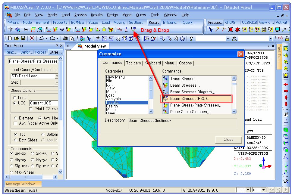
Adding a Command
Removing a Command
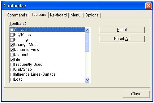
Toolbars tab
Show or hide each Toolbar.
 :Reset the selected Toolbars to default.
 :Reset all the Toolbars to default.
Keyboard tab
The user can manually define the shortcut keys for each function.
Categories:
Select a category in which the shortcut key to be defined belongs.
Commands:
Select a command and define/modify the shortcut key for the command.
Current:
Display the currently defined shortcut keys.
Press New Shortcut:
Define the new shortcut key.
 :Reset all the shortcut keys as default.
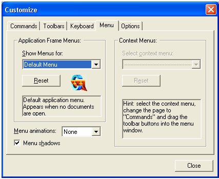
Menu tab
Currently Application Frame Menus and Context Menus are not supported.
Menu:
Midas Civil provides the Pull-Down Main Menu. Select a Pull-Down type.
Menu shadow:
Give a shadow effect to the Pull-Down Menu.
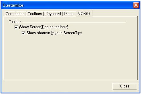
Options tab
Set Toolbar options.
Show Screen Tips on toolbars
Show shortcut keys in Screen Tips